Improving user activation with better in-app onboarding
Improving user activation with better in-app onboarding
Helping first-time users understand Kris+, discover its value, and activate faster.
Helping first-time users understand Kris+, discover its value, and activate faster.
SUMMARY
SUMMARY
SUMMARY
Kris+ is a lifestyle and rewards app that lets users earn and redeem KrisFlyer miles, access exclusive deals, and make seamless payments at partner merchants.
This project focused on improving first-time user activation by helping users better understand how Kris+ works and how to get value from the app from their very first session.
Kris+ is a lifestyle and rewards app that lets users earn and redeem KrisFlyer miles, access exclusive deals, and make seamless payments at partner merchants.
This project focused on improving first-time user activation by helping users better understand how Kris+ works and how to get value from the app from their very first session.
Kris+ is a lifestyle and rewards app that lets users earn and redeem KrisFlyer miles, access exclusive deals, and make seamless payments at partner merchants.
This project focused on improving first-time user activation by helping users better understand how Kris+ works and how to get value from the app from their very first session.
ROLE
ROLE
ROLE
Product Designer
Product Designer
Product Designer
TEAM
TEAM
TEAM
Design, Product, Engineering, Marketing
Design, Product, Engineering, Marketing
Design, Product, Engineering, Marketing
COMPANY
COMPANY
COMPANY
Singapore Airlines
Singapore Airlines
Singapore Airlines
TIMELINE
TIMELINE
TIMELINE
2 months
2 months
2 months
Problem
Problem
New users struggled to understand how Kris+ worked after onboarding, often relying on external resources before making their first purchase.
New users struggled to understand how Kris+ worked after onboarding, often relying on external resources before making their first purchase.
New users struggled to understand how Kris+ worked after onboarding, often relying on external resources before making their first purchase.
Solution
Solution
Designed a guided in-app onboarding experience that introduced Kris+'s value proposition, explained key workflows, and surfaced guidance throughout the app.
Designed a guided in-app onboarding experience that introduced Kris+'s value proposition, explained key workflows, and surfaced guidance throughout the app.
Designed a guided in-app onboarding experience that introduced Kris+'s value proposition, explained key workflows, and surfaced guidance throughout the app.
Outcome
Outcome
User activation increased by 11%, with users making their first purchase within their first 3 sessions.
Time-to-activation also improved by 14%, meaning users reached activation faster.
User activation increased by 11%, with users making their first purchase within their first 3 sessions.
Time-to-activation also improved by 14%, meaning users reached activation faster.
User activation increased by 11%, with users making their first purchase within their first 3 sessions.
Time-to-activation also improved by 14%, meaning users reached activation faster.
The problem
The problem
Despite users joining Kris+ primarily to earn miles, many struggled to understand how the app worked or how to get started.
Despite users joining Kris+ primarily to earn miles, many struggled to understand how the app worked or how to get started.
Despite users joining Kris+ primarily to earn miles, many struggled to understand how the app worked or how to get started.
Quarterly survey feedback revealed that >30% of user issues stemmed from users struggling to understand Kris+'s value proposition and core functionality. Many perceived the app as complicated and difficult to use, resulting in early drop-offs and reliance on external support.
To better understand these behaviours, I conducted 15 user interviews and usability tests to explore users' first impressions and sentiments.
The research surfaced two key insights:
Quarterly survey feedback revealed that >30% of user issues stemmed from users struggling to understand Kris+'s value proposition and core functionality. Many perceived the app as complicated and difficult to use, resulting in early drop-offs and reliance on external support.
To better understand these behaviours, I conducted 15 user interviews and usability tests to explore users' first impressions and sentiments.
The research surfaced two key insights:
Quarterly survey feedback revealed that >30% of user issues stemmed from users struggling to understand Kris+'s value proposition and core functionality. Many perceived the app as complicated and difficult to use, resulting in early drop-offs and reliance on external support.
To better understand these behaviours, I conducted 15 user interviews and usability tests to explore users' first impressions and sentiments.
The research surfaced two key insights:
Users didn't know where to start
Users didn't know where to start

After brief introduction screens, users landed directly on a feature-heavy homepage with little guidance, leaving many feeling overwhelmed and unsure of how to navigate or use the app effectively.
After brief introduction screens, users landed directly on a feature-heavy homepage with little guidance, leaving many feeling overwhelmed and unsure of how to navigate or use the app effectively.
Earning and redeeming miles felt confusing
Earning and redeeming miles felt confusing
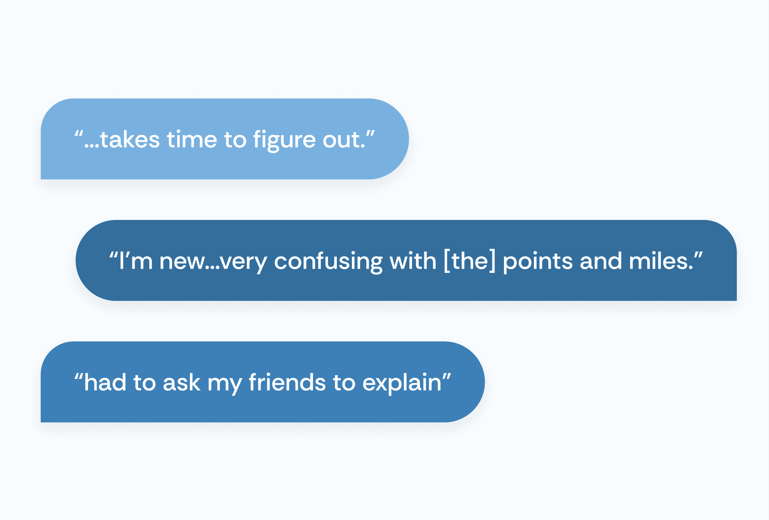
Users found the rewards ecosystem difficult to understand and perceived earning and redeeming miles as overly complex.
With over 70% of survey respondents citing earning miles as their primary reason for using Kris+, improving clarity around this area presented a significant opportunity.
Users found the rewards ecosystem difficult to understand and perceived earning and redeeming miles as overly complex.
With over 70% of survey respondents citing earning miles as their primary reason for using Kris+, improving clarity around this area presented a significant opportunity.
Defining the MVP
Defining the MVP
Together with my product owner, I co-facilitated brainstorming and ideation workshops with cross-functional stakeholders to explore solutions that addressed the research findings.
Given the project timeline, we prioritised high-value enhancements within a single release while balancing user needs and business goals.
Together with my product owner, I co-facilitated brainstorming and ideation workshops with cross-functional stakeholders to explore solutions that addressed the research findings.
Given the project timeline, we prioritised high-value enhancements within a single release while balancing user needs and business goals.
Together with my product owner, I co-facilitated brainstorming and ideation workshops with cross-functional stakeholders to explore solutions that addressed the research findings.
Given the project timeline, we prioritised high-value enhancements within a single release while balancing user needs and business goals.
The solution
The solution
The MVP focused on 2 complementary initiatives:
The MVP focused on 2 complementary initiatives:
The MVP focused on 2 complementary initiatives:
01
01
A dedicated in-app onboarding guide to help users understand Kris+ and its core features.
A dedicated in-app onboarding guide to help users understand Kris+ and its core features.
A dedicated in-app onboarding guide to help users understand Kris+ and its core features.
Users relied on external resources to learn how Kris+ worked because the app offered little guidance after onboarding. This fragmented learning experience created unnecessary friction during first-time use and reduced opportunities to educate users within the app itself.
What I did:
Consolidated onboarding into a single in-app guide
Structured content progressively, introducing the core value proposition before guiding users through key actions.
Ideated and validated the information architecture and content hierarchy before UI design.
Surfaced the guide on the Homepage and Account page — touchpoints with the highest first-session traffic based on clickstream analysis
Users relied on external resources to learn how Kris+ worked because the app offered little guidance after onboarding. This fragmented learning experience created unnecessary friction during first-time use and reduced opportunities to educate users within the app itself.
What I did:
Consolidated onboarding into a single in-app guide
Structured content progressively, introducing the core value proposition before guiding users through key actions.
Ideated and validated the information architecture and content hierarchy before UI design.
Surfaced the guide on the Homepage and Account page — touchpoints with the highest first-session traffic based on clickstream analysis
Users relied on external resources to learn how Kris+ worked because the app offered little guidance after onboarding. This fragmented learning experience created unnecessary friction during first-time use and reduced opportunities to educate users within the app itself.
What I did:
Consolidated onboarding into a single in-app guide
Structured content progressively, introducing the core value proposition before guiding users through key actions.
Ideated and validated the information architecture and content hierarchy before UI design.
Surfaced the guide on the Homepage and Account page — touchpoints with the highest first-session traffic based on clickstream analysis

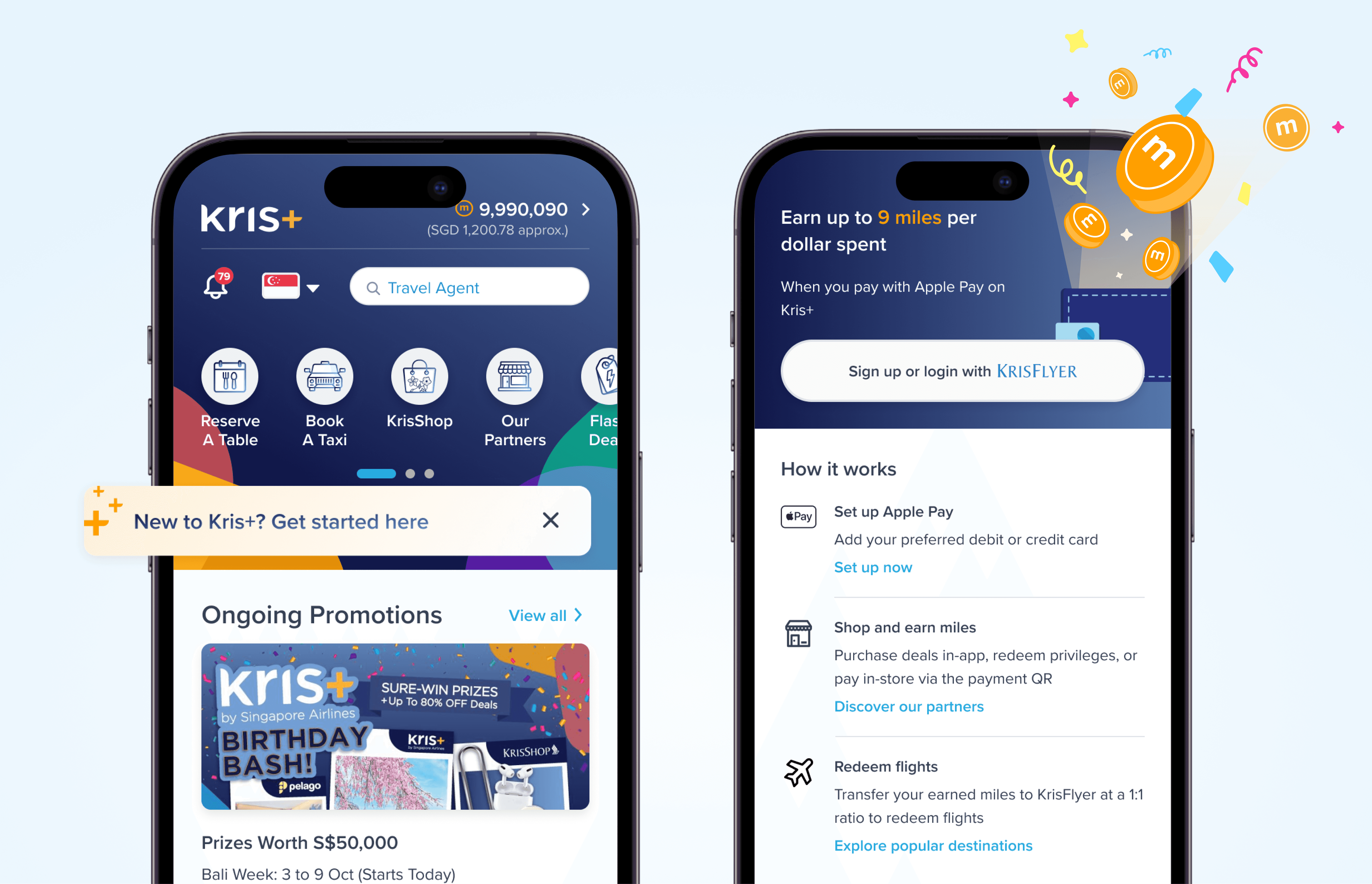
Consolidated onboarding into a dedicated in-app guide. A single destination that reinforces the value proposition, guides first actions, and encourages users to discover key features.
Accessible from high-traffic entry points. Surfaced on both the Homepage (banner) and Account page ('New' badge), making the guide easy to discover throughout a user's first sessions.
02
02
Transformed the Wallet tab into an onboarding touchpoint.
Transformed the Wallet tab into an onboarding touchpoint.
The Wallet tab was disabled for logged-out users, preventing them from exploring one of Kris+'s core features before creating an account. Rather than showing a disabled state, we used this moment to educate users on the value of Kris+ and guide them toward signing up.
What I did:
Replaced the disabled state with the onboarding guide, highlighting the benefits of Kris+ before prompting users to sign up
Repurposed the onboarding guide within the Wallet tab, requiring only minor UI changes instead of designing a new experience
Added a clear sign up /log in CTA to shorten the path to account creation
Despite being a lightweight design change, it achieved a 19% conversion rate from Wallet visitors to account login / sign ups
The Wallet tab was disabled for logged-out users, preventing them from exploring one of Kris+'s core features before creating an account. Rather than showing a disabled state, we used this moment to educate users on the value of Kris+ and guide them toward signing up.
What I did:
Replaced the disabled state with the onboarding guide, highlighting the benefits of Kris+ before prompting users to sign up
Repurposed the onboarding guide within the Wallet tab, requiring only minor UI changes instead of designing a new experience
Added a clear sign up /log in CTA to shorten the path to account creation
Despite being a lightweight design change, it achieved a 19% conversion rate from Wallet visitors to account login / sign ups
The Wallet tab was disabled for logged-out users, preventing them from exploring one of Kris+'s core features before creating an account. Rather than showing a disabled state, we used this moment to educate users on the value of Kris+ and guide them toward signing up.
What I did:
Replaced the disabled state with the onboarding guide, highlighting the benefits of Kris+ before prompting users to sign up
Repurposed the onboarding guide within the Wallet tab, requiring only minor UI changes instead of designing a new experience
Added a clear sign up /log in CTA to shorten the path to account creation
Despite being a lightweight design change, it achieved a 19% conversion rate from Wallet visitors to account login / sign ups

Repurposed the onboarding guide for the Wallet tab. Instead of blocking logged-out users, the Wallet tab became an onboarding touchpoint that explained Kris+'s value and encouraged sign-ups.
Outcomes
Outcomes
The MVP improved first-time activation by helping users better understand Kris+ before making their first purchase.
The MVP improved first-time activation by helping users better understand Kris+ before making their first purchase.
The MVP improved first-time activation by helping users better understand Kris+ before making their first purchase.
19%
19%
wallet conversion rate
wallet conversion rate
wallet conversion rate
wallet visitors who signed up or logged in
wallet visitors who signed up or logged in
wallet visitors who signed up or logged in
11%
11%
Increase in user activation
Increase in user activation
Increase in user activation
completed 1st purchase within first three sessions
completed 1st purchase within first three sessions
completed 1st purchase within first three sessions
14%
14%
Reduction in time-to-activation
Reduction in time-to-activation
Reduction in time-to-activation
Takeaways
Takeaways
Effective onboarding helps users reach value fast
Effective onboarding helps users reach value fast
Instead of introducing every capability upfront, structuring information progressively allow users to understand why they should use Kris+ before learning how. This helps reduce uncertainty and make the first experience feel more approachable.
Instead of introducing every capability upfront, structuring information progressively allow users to understand why they should use Kris+ before learning how. This helps reduce uncertainty and make the first experience feel more approachable.
Instead of introducing every capability upfront, structuring information progressively allow users to understand why they should use Kris+ before learning how. This helps reduce uncertainty and make the first experience feel more approachable.
Shared success metrics created stronger stakeholder alignment
Shared success metrics created stronger stakeholder alignment
I framed design recommendations around both research insights and activation goals, which made it easier to align stakeholders and provided a clear framework for evaluating the MVP after launch.
I framed design recommendations around both research insights and activation goals, which made it easier to align stakeholders and provided a clear framework for evaluating the MVP after launch.
I framed design recommendations around both research insights and activation goals, which made it easier to align stakeholders and provided a clear framework for evaluating the MVP after launch.
The MVP shifted onboarding from a one-time flow to an ongoing product experience.
The MVP shifted onboarding from a one-time flow to an ongoing product experience.
The project introduced a more contextual approach to onboarding that informed subsequent improvements across the app. These include educational surfaces in other user journeys, such as bottom sheets to explain partner types.
The project introduced a more contextual approach to onboarding that informed subsequent improvements across the app. These include educational surfaces in other user journeys, such as bottom sheets to explain partner types.
The project introduced a more contextual approach to onboarding that informed subsequent improvements across the app. These include educational surfaces in other user journeys, such as bottom sheets to explain partner types.
Additional Contributions
Additional Contributions
Alongside the onboarding redesign, I also refreshed the introductory screens with a new set of illustrations and motion assets.
Alongside the onboarding redesign, I also refreshed the introductory screens with a new set of illustrations and motion assets.
Alongside the onboarding redesign, I also refreshed the introductory screens with a new set of illustrations and motion assets.